prop stylist

New in the shop! Handmade pillows from vintage textiles

I've been taking a break from blogging and working on the house (and running my business to some extent), since August of last year. I took a full time position working with Etsy (WAHOO!) and after that it took a while to readjust.

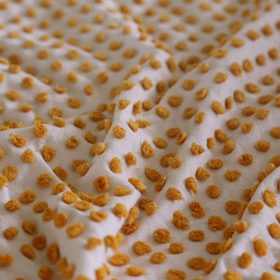
I'm feeling a lot more settled now, and I was finally able to finish (at least in part) a project I have had waiting in the wings for quite a while. PILLOWS! This small collection is made from vintage chenille comforters I sourced from all over. I have been collecting them for at least a couple of years now. I love chenille but it often has a granny look to it (which lets be honest, I for one like a little of, but too much becomes apparent very quickly... one can only have a granny moment or two in a space before the whole room looks dated... I'm getting off track). I specifically gravitated towards the simple more graphic patters of chenille (popcorn aka polka dot tufting is my favorite) and stuck with on trend and classic colors. I then backed each pillow with a modern fabric to balance the old with the new and create a fresh feel.

I am hoping I will be able to do a repeat of these pillows but that involves finding the exact same chenille in excellent condition a second time around (not impossible but not guaranteed) so consider this a limited run! 

I'm so pleased to introduce:


chenille_white_popcorm.jpg
popcorn_and_stripe_chenille.jpg
chenille_in_the_sunlight.jpg
fabric_detail_chenille.jpg
IMG_7375.jpg

Farmhouse entryway in progress

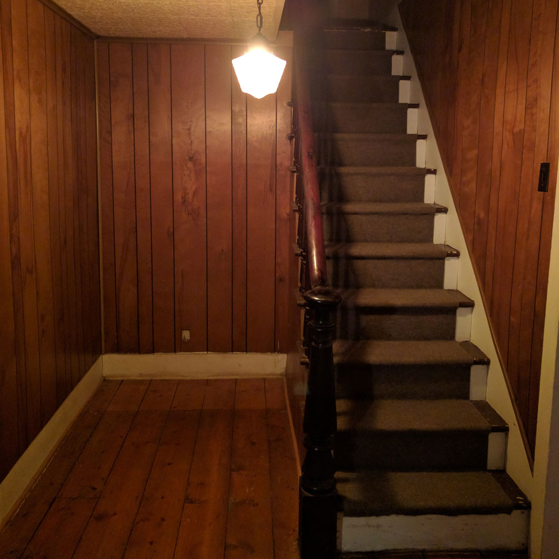
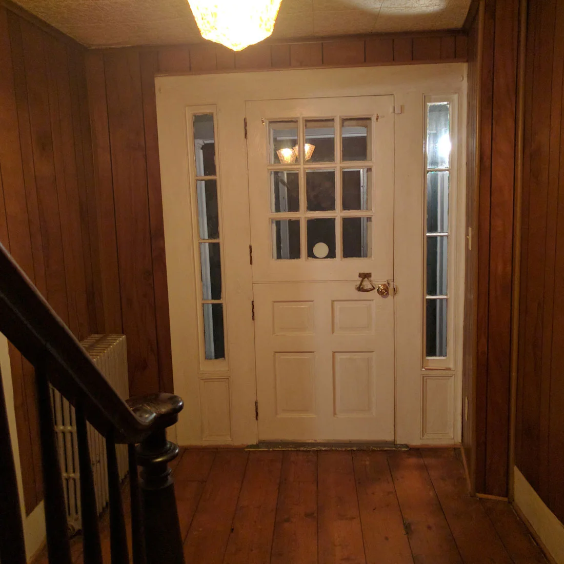
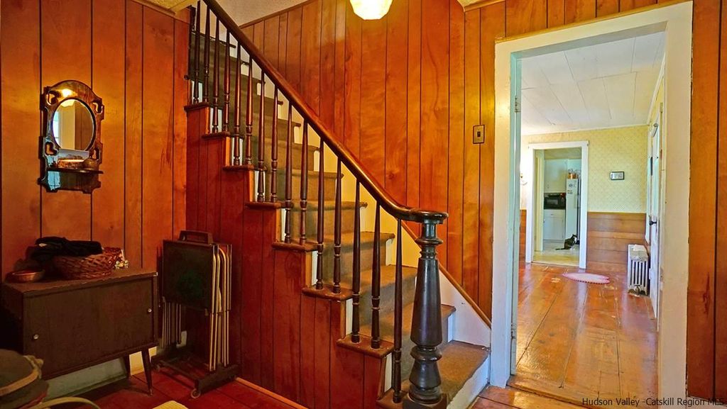
The entryway is the first impression your guests get when they come for a visit, so it was at the top of my list for a makeover. The farmhouse is full of wood paneling, but the worst offender, floor to ceiling, dark and dreary was the entryway. 

Granted these photos were taken at night, but it didn't feel super inviting to me. Before we even closed on the property I knew this entryway needed a fresh coat of a light colored paint to brighten the space and utilize the natural light that floods in through the windows around our antique dutch door.

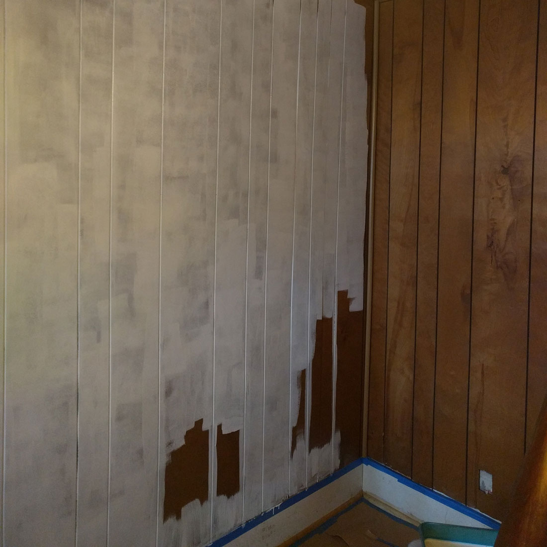
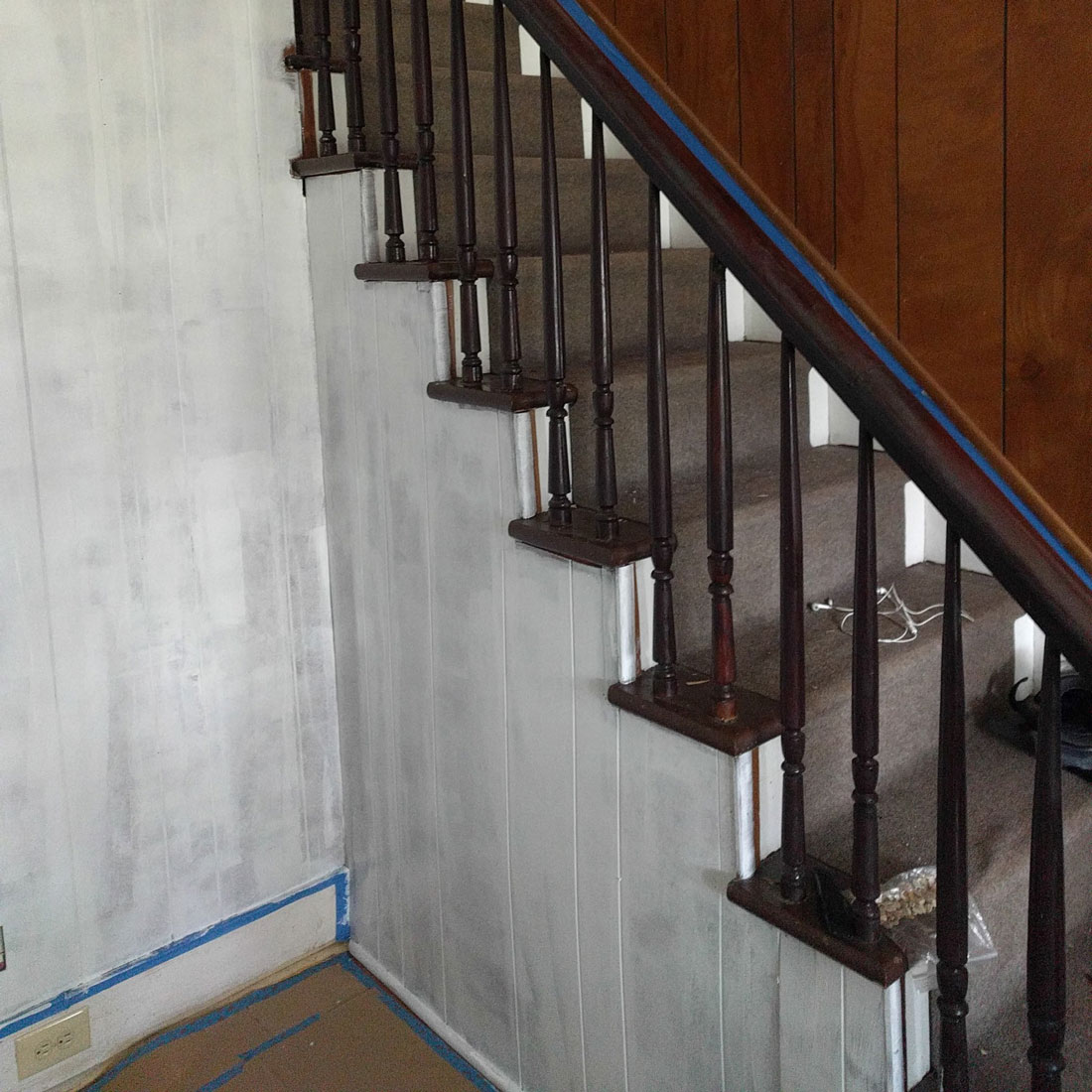
Now, if you have ever painted wood paneling, you know it is quite a process. You absolutely must prime. Your paint says paint with primer, but you need something serious to cover up this slick dark surface. I used Zinsser, but I understand Kilz makes excellent primers as well. The tricky part about the paneling is the spaces between. There are so many grooves in the wall and you have to make sure you get enough of the primer into them, but you also want to make sure the flat part of the wall that abuts keeps a smooth coverage. I developed a system where I would do about 2 ft sections of the wall floor to ceiling before moving on. I used a paint brush to get the primer in the crevices and then came back with a small roller to smooth the build up from the paint brush and more quickly cover the flat surfaces. The results were great, but it was way more time consuming that simply cutting in and rolling like you would do on dry wall or plaster etc.

I waited a full day to let my primer dry. Mainly because my back needed a rest after all the squatting and reaching (excellent work out) but also that stuff is kind of thick so I thought better safe than sorry. 

I don't know if I'm the only one, but this stage of painting makes me feel so nervous. I have painted quite a few spaces in my time, but when it looks all splotchy and uneven like this is makes me queasy, so next day I was ready to put my first coat on, lower back pain be damned.  

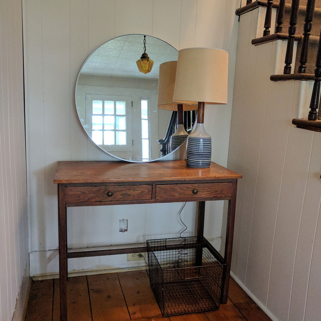
So this is where I added an extra step to my painting that I have come to decide was well worth it. I had to repeat the process of cutting in and filling gaps with my chosen wall paint. I continued doing sections at a time like with the primer to keep a smooth coat, but this time after I rolled my paint on the flat surfaces I went back with a large paint brush lightly coated with paint and gently brushed down from floor to ceiling creating a very subtle but really beautiful texture to my surfaces. It probably added about an hour and a half of work to my space, but it has more of an authentic antique farmhouse feel to it. 

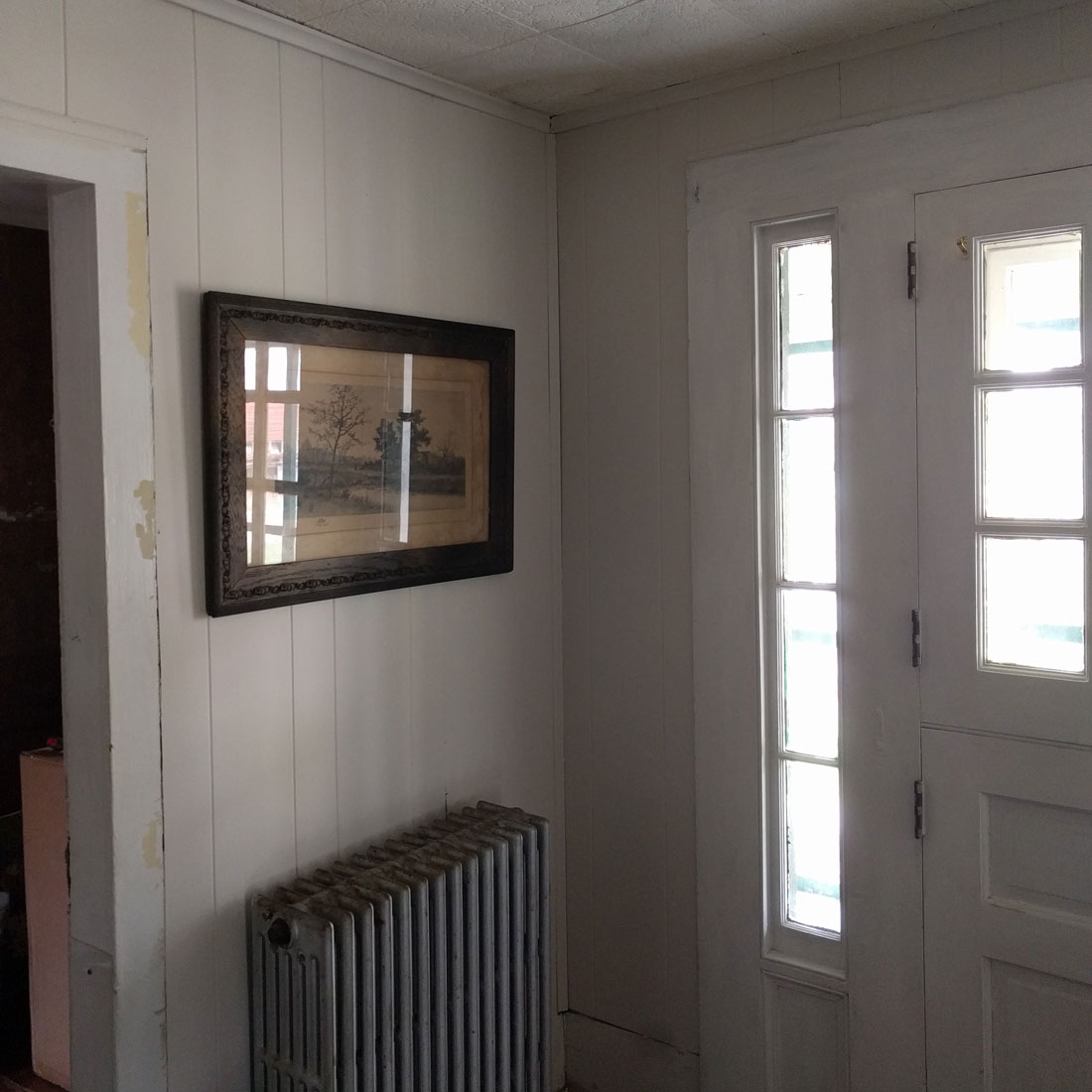
This space is by no means finished. It needs a new ceiling, the trim and door are getting stripped and painted a navy blue color that has a touch of graphite grey to it. Really lovely color. I also want to remove the pendant light that hangs to the left of the stairs (you can catch it's reflection in the first after shot). It's a nice vintage piece, but it casts an orange glow through the space and I think a flush mount centered in the space between the door and where the stairs begin would be more appropriate for this room. But I would say the space is literally like night and day already and I am truly pleased with the direction it's heading!

Fall inspiration

Where does the time go? We are deep into fall with Halloween just around the corner. Speaking of which, I came across the most perfectly imperfect pumpkin the other day and it had to be mine. In order to justify the purchase I figured I better put together a little fall inspiration shoot for the shop... Have you started planning your Thanksgiving table yet? Nothing makes a statement like some gorgeous vintage glassware! Pictured are Bauerware ceramic pottery mugs with copper handles and MCM smoke colored glass whiskey glasses. Both are perfect for entertaining and come in a set of 4. Cheers!

brooklyn prop stylist courtney dawley

Other people's products - July

Other people's products - July

I decided as a maker, being so inspired by other people's work as we all are, I wanted to share design I feel particularly fond of on a monthly basis. Today is my first post to that effect. All the products are clean, functional and something I would love to have for my home.

Read More

Doors, Doors, Doors...

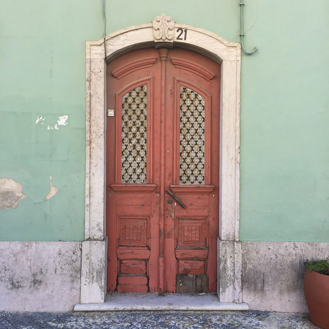
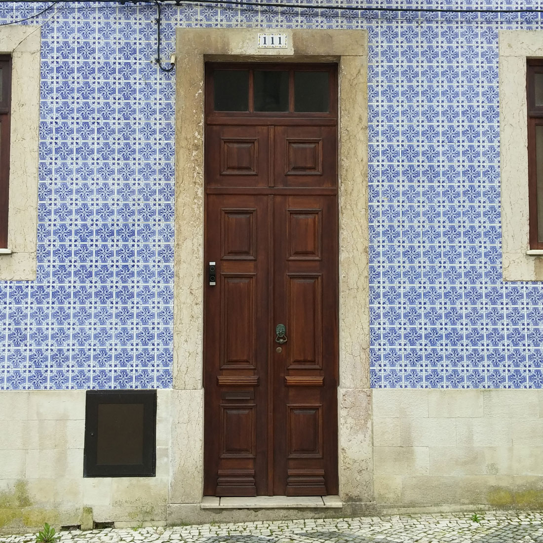
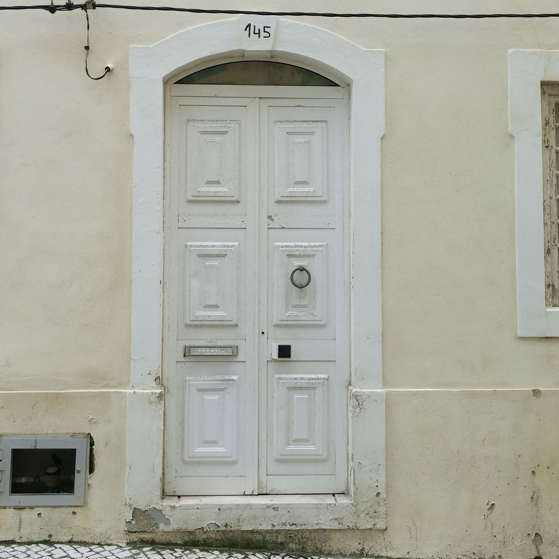
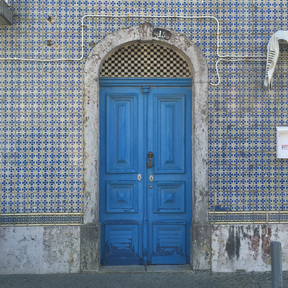
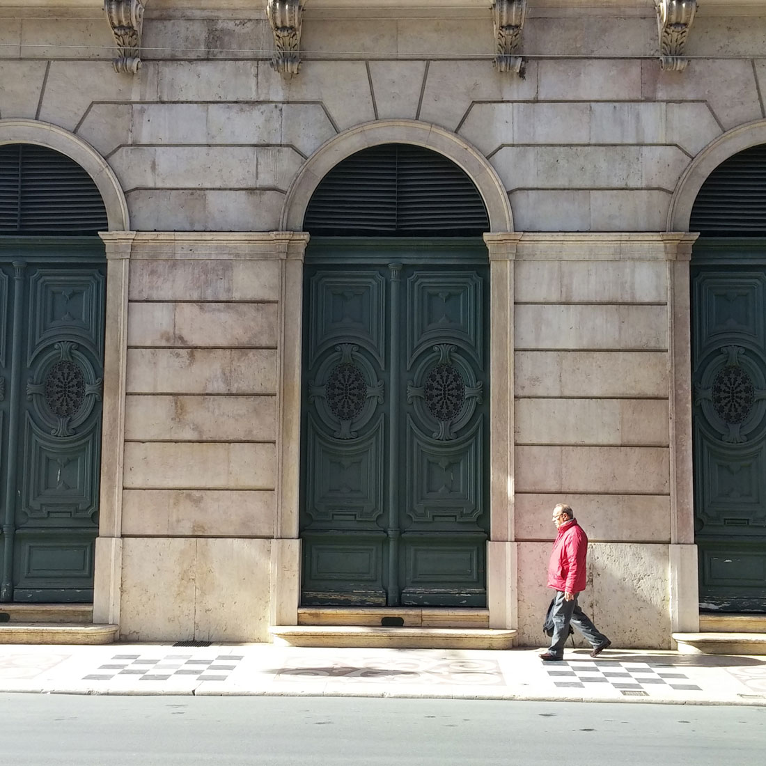
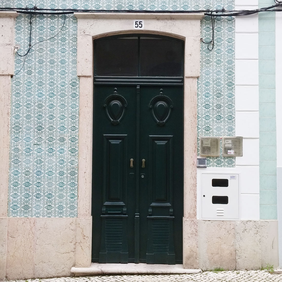
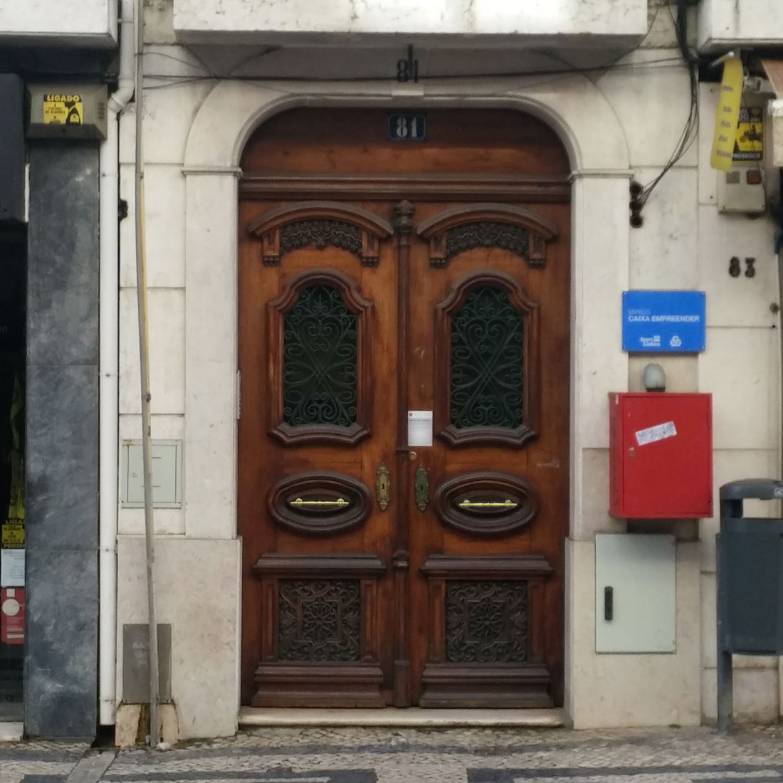
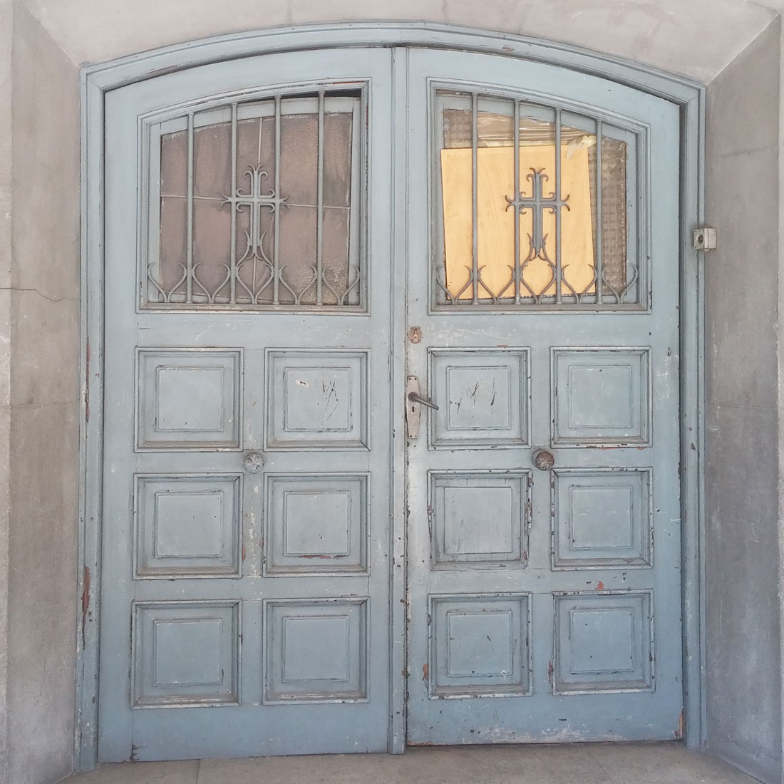
If you follow my instagram feed, you know I love doors. I recently visited Portugal with a brief stopover in Spain and the doors were fabulous! Not only the doors, also the plant life, pastries, hospitality and the architecture overall. But, this post is dedicated to doors. These need no description. I will let them speak for themselves.

On my next trip to Portugal I want to spend an entire day (or 2??) in Sintra. It sits perched atop a mountain with a palace at the very top. The town climbs the hillside up winding roads amidst a magical forest. I want to walk the streets and photograph all the fabulous doors! It was raining the day we went to see the palace, next time I will make sure the sun is shining and I have ample time to explore. Stay tuned for more posts from my recent trip to Portugal.

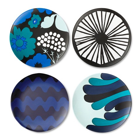
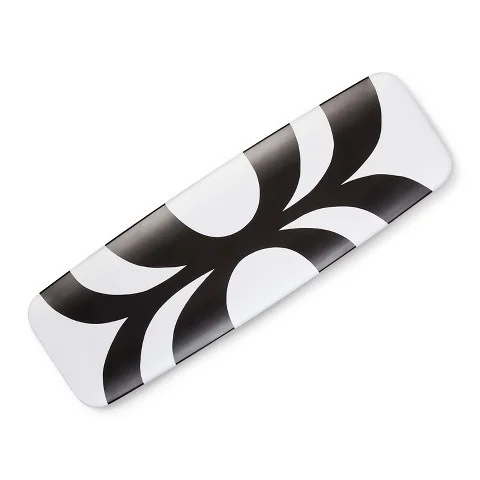
Marimekko x Target

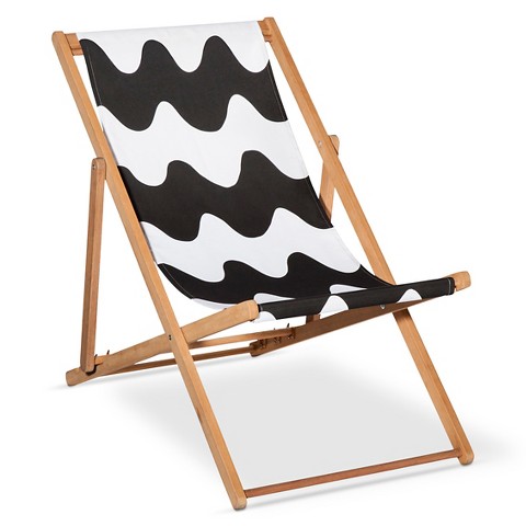
It's happened! It launched today, a collaboration between two of my favorites, Target and Marimekko. Now, you know I had scoped out the goodies ahead of time, because they offered a sneak peak on the site. I have been salivating over a fabulous umbrella for my backyard for days and with the line becoming available today, I ordered it this morning!

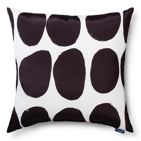
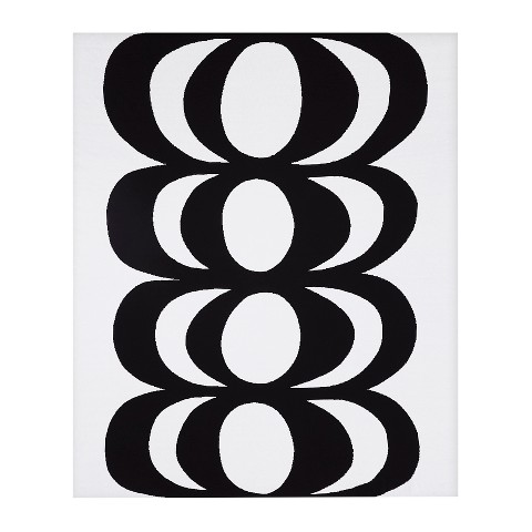
Now, this was not the only item I wanted... But we have to make choices and so instead of buying everything I loved I decided to put together a little post of my picks. And if someone happens to see this, who is in the market to buy me a gift, this would be a great guide for that as well! Ha ha, seriously.

I was very happy to see that both the Kaivo and Koppelo prints made it into the collection. It's great to Marimekko bring their designs to a more affordable venue. I always love their collaborations with Crate & Barrel, but hopefully this will bring their design sense to even more homes across the country! You can check out the full collection including clothes, bags and of course products for home here.

Kaj Franck a little designer profile

Kaj Franck is a Finnish designer best known for his work for Arabia Finland. He studied furniture design in 1932 at the Central School of Industrial Design in Helsinki. Kaj Franck designed ceramics, glassware and my favorite, enamelware.  He went on to design glassware for Iittala, introducing the idea of individually sold glasses rather than the traditional set.

There are many patterns associated with Kaj Franck's enamelware. The most often found and widely produced are the mushroom pattern bowls. I have seen salad bowls and serving bowls in this pattern, it subsequently also ends up being the most affordable. Harder to come by is the elusive lobster pattern. I was lucky enough to come across one which is pictured below.

$125 on Etsy by FoundbyaPropStylist

$125 on Etsy by FoundbyaPropStylist

There are also hearts, vegetables, little blue clovers, the red daisy pattern (pictured below on mugs), chevril, cherries, there are about 20 patterns in all.

$62 each on Etsy by FoundbyaPropStylist

$62 each on Etsy by FoundbyaPropStylist

Many Arabia Finland aka Finel pieces you find will be stamped on the bottom as the mug shown above, but many are not. If you want to start collecting the best thing to do is identify the patterns associated with the designer and brand. I for one was hooked the first time I got my hands on a mushroom bowl! Stop by my etsy store as I almost always have some Kaj Franck in stock.